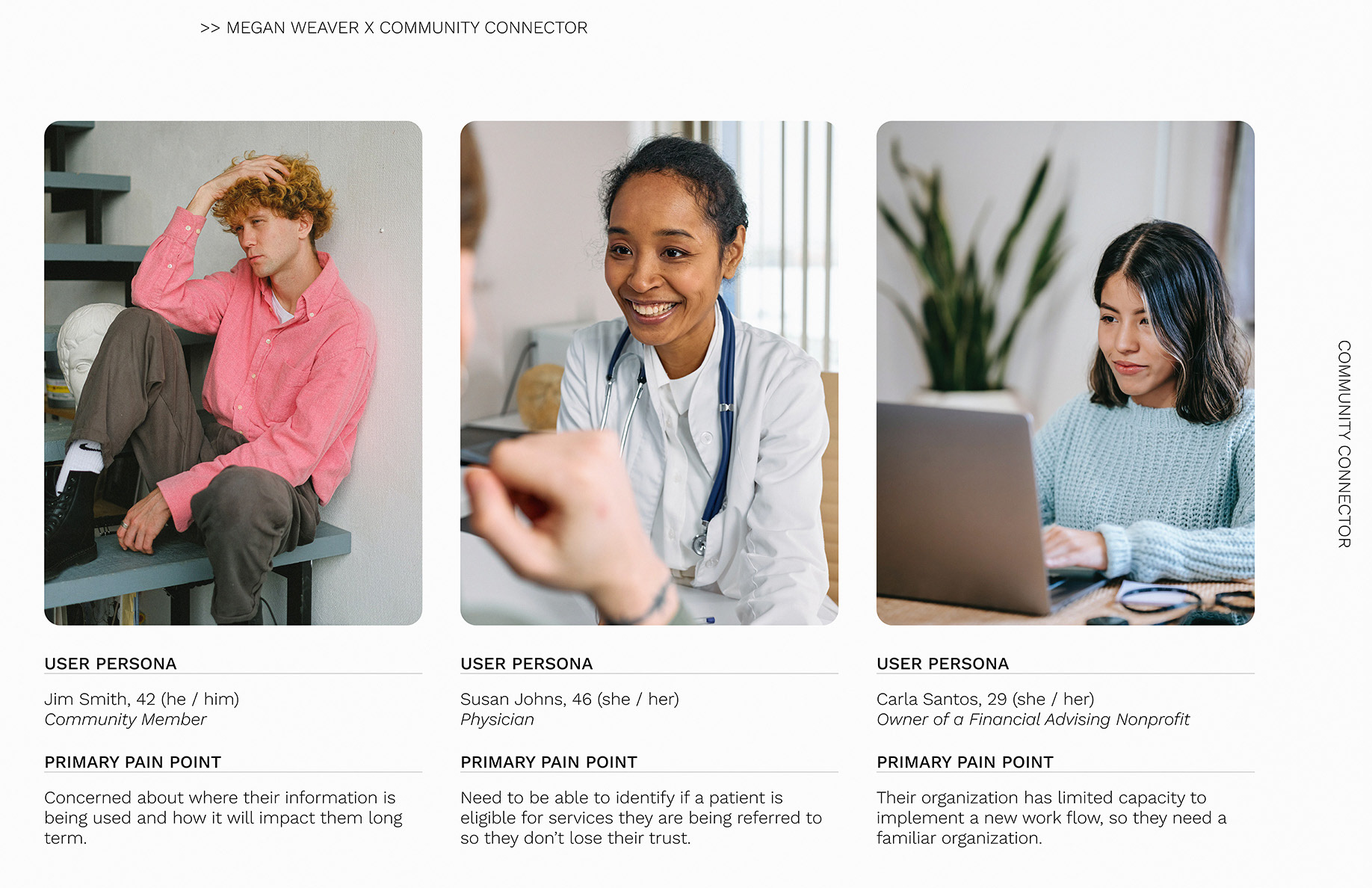
A simplified version of the 3 final personas to reference throughout the design process.

The two User Journeys specific to patient onboarding were A/B Tested with intended users to identify which flow would get users to appropriate resources more effectively.
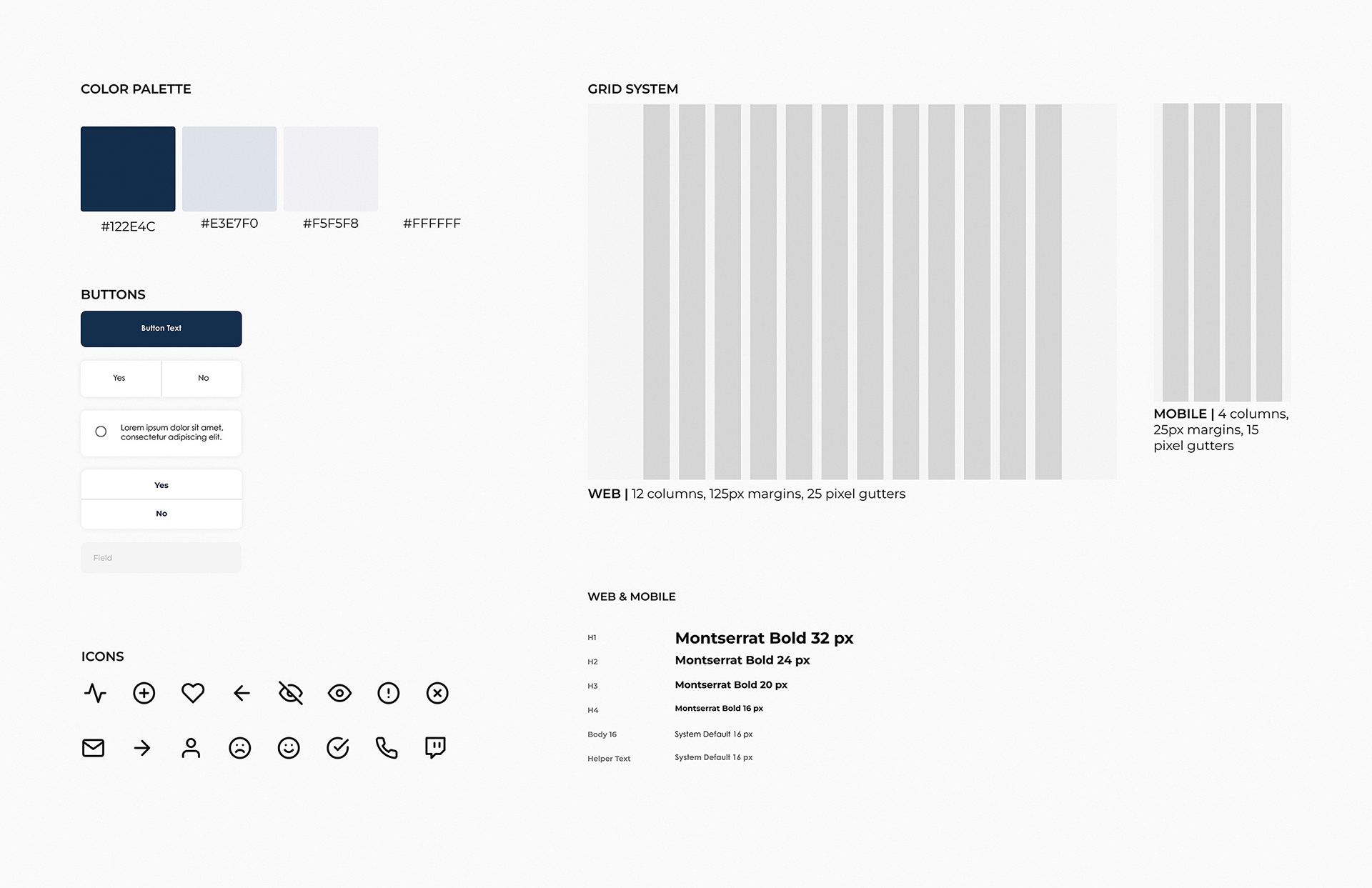
The style tile provides a high level overview of the UI. The choice of serene cool blues, gentle iconography, and clean sans-serif fonts were deliberate, aiming to create a calming user experience for community members with unmet social care needs.
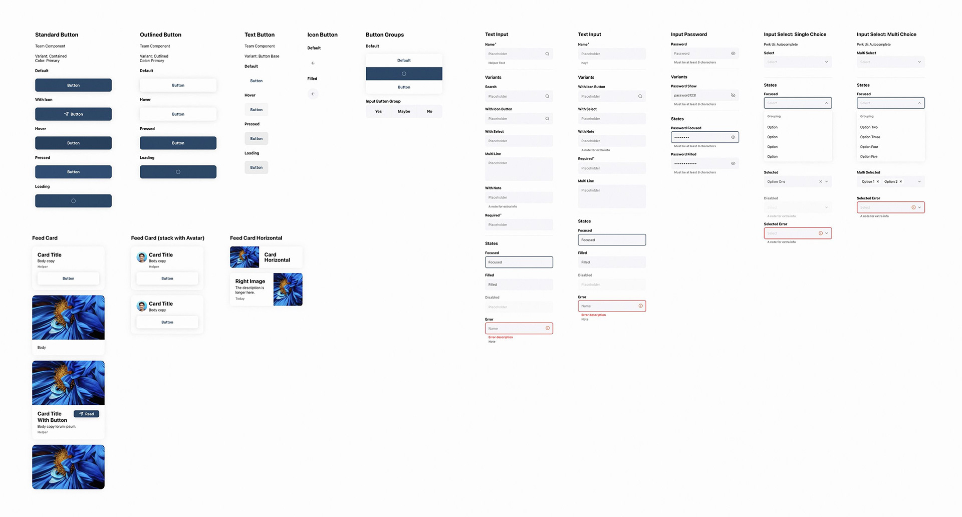
The style guide was applied to the component library and then wireframes for visual consistency and general efficiency.
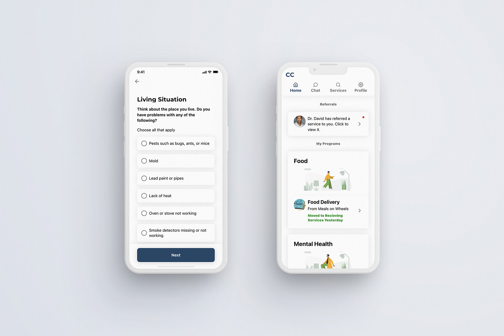
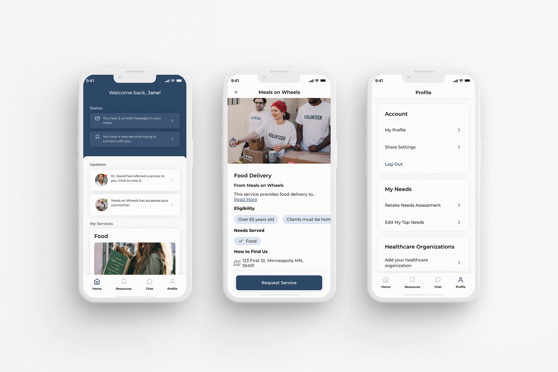
The main mobile app concern, privacy, was addressed by adding share settings, clarifying data usage, and offering optional fields.
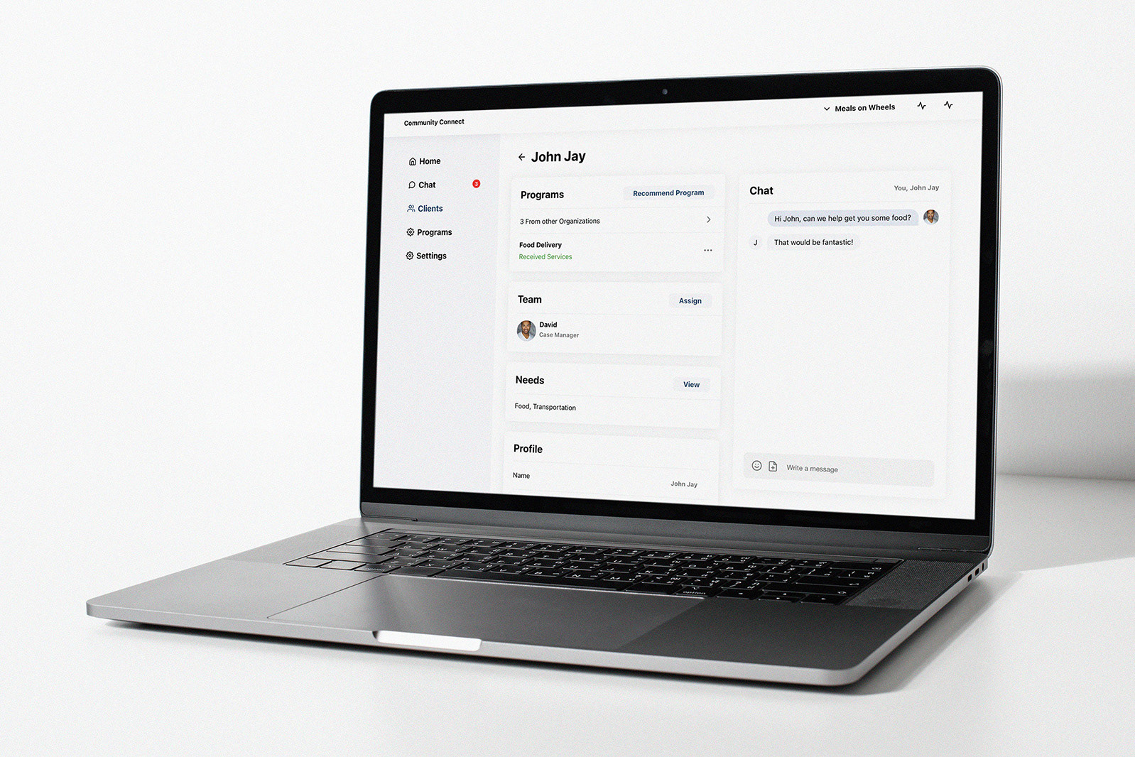
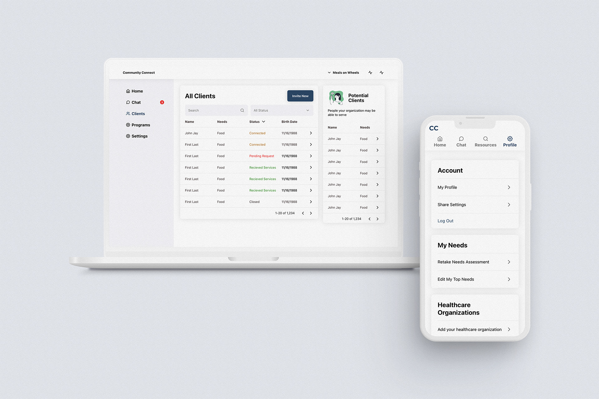
The key concern on the community dashboard, capacity, was addressed by simplifying tasks, centralizing patient data, and enabling multi-staff collaboration.
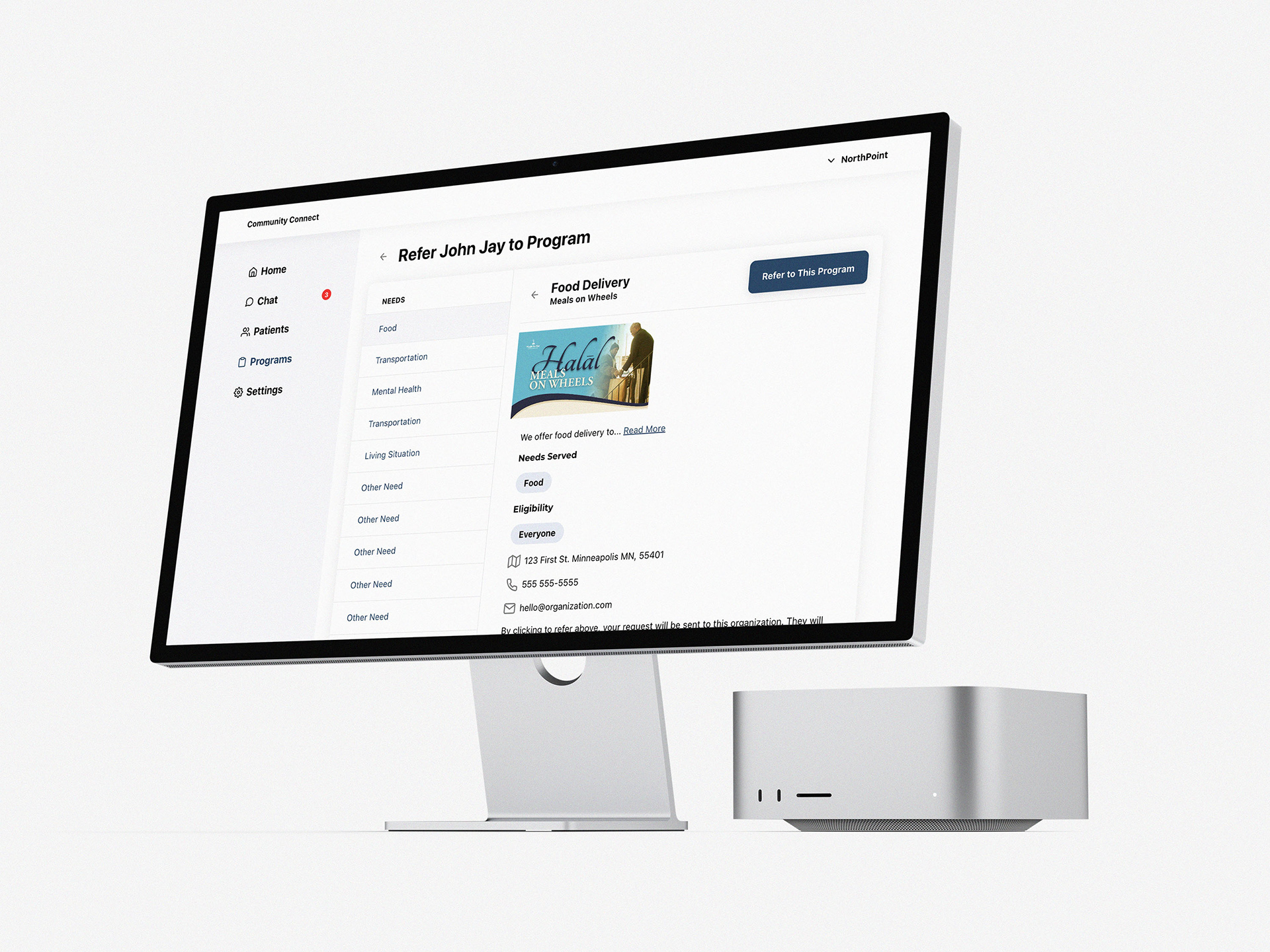
The provider portal's primary concern, patient trust, was resolved by enhancing the referral process to ensure patients qualify for services they're being referred to.
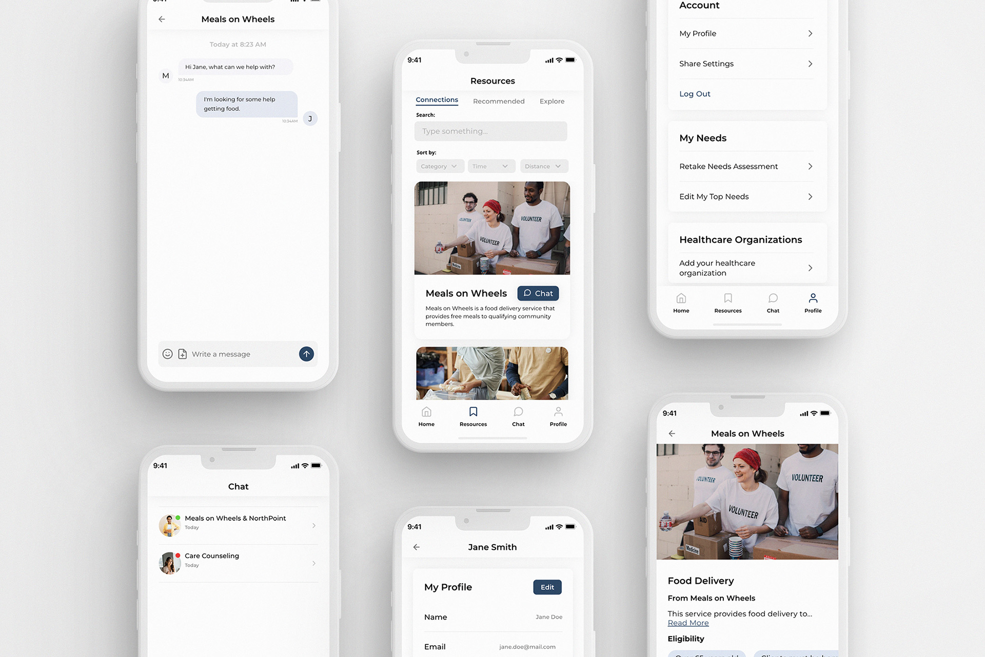
The final community member mobile application.